A neutral-colored home offers a wonderful backdrop for your day-to-day life, but it can get boring over time. That’s when accent colors become an excellent idea. If you’ve ever wondered how to choose accent colors, you’ll want to pick options that add depth and contrast to neutral-colored homes and offer a way to subtly introduce new hues without creating an overwhelming look. Accent colors play an important role in interior design, and by learning how to use them properly, you can significantly boost your home’s aesthetics and value.
What Are Accent Colors?
Accent colors are color shades used sparingly to create visual interest and contrast within a room. They are often applied to one wall, to pieces of furniture, to siding, trim, molding, doors, soft furnishings, and decorative accessories. The goal of using accent colors is to add personality, character, and dimension to a room painted in neutral or primary colors, and to create focal points in a room that make the atmosphere more welcoming.
Why Accent Colors Matter in Interior Design
Accent colors are more than a decorative choice. In interior design, they serve as tools of communication and contrast, depending on how you use them.
Accent colors:
- Enhance a space’s overall mood and atmosphere, adding character to the setting.
- Add depth, dimension, and personality to a room that is otherwise painted in plain or neutral tones.
- Can help tie different elements of a room together, creating a cohesive look.
- Can be changed or repainted without requiring a complete redesign.
How to Choose the Right Accent Color
Accent colors serve as a signature touch. Whether you want to play safe or go bold, choosing the right accent color can bring a room to life.
Consider the Base Color Palette
Accent colors work well only if they complement and contrast with the primary colors. Consider your base color palette and shortlist accent colors that complement the room’s neutral or primary tones. If you can’t decide, contact a painting contractor for a color consultation.
Think About the Mood and Function
Different colors evoke different emotions. Consider the space you want to create; do you want the room to feel cozy and engaging or spacious and calming? Pay attention to color psychology and align with the mood.
Use the 60-30-10 Rule
The 60-30-10 rule is a classic interior design principle that recommends using 60% of the dominant color, 30% of the secondary color, and 10% of the accent color. This is a golden equation that many interior designers follow to create a space that feels welcoming and engaging without being dramatic.
Factor in Lighting
Lightning is a crucial element of a good-looking room, and it also influences your color choices. Rooms with plenty of natural lighting can handle bold colors, while darker spaces without much light benefit more from lighter, softer shades.
Popular Accent Colors in 2026
In the last few years, bold, earthy colors have been making a mark in the interior design world, alongside the rising popularity of soft pastels and metallics. These trends continue to evolve in 2026, especially with high-quality brands offering such a wide range of options.
Bold Jewel Tones
Bold jewel tones make great accent colors. Some popular choices include:
- SW 6985 Green Jewel: A vibrant shade of green, this is perfect for rooms with flexible lighting.
- SW 9641 Dew Drop: A bolder color that works best in rooms with plenty of natural light.
- SW 6300 Burgundy: A deep jewel tone that pairs amazingly well with wooden features.
Warm Earthy Hues
The rise of earthy tones offers strong colors for accents.
- SW 2803 Rookwood Terra Cotta: A mesmerizing color that works well with lighter shades.
- SW 9532 Earthy Ochre: A clay-earth pigment that highlights any room.
- SW 9100 Umber Rust: A warmer, earthy hue for rustic architecture.
Soft Pastels
Soft pastel tones are highly versatile and can be used in a wide range of spaces.
- SW 6617 Blushing: A shade of pink with beige undertones adds subtle character to any room.
- SW 9130 Evergreen Fog: A shade of green, acting both as a soft pastel and an earthy tone.
- SW 6835 Euphoric Lilac: A unique yet flexible color that’s perfect for subtle pops.
Metallics
Metallics work best in luxurious environments and Victorian homes.
- SW 6401 Independent Gold: Gold accents enhance any room and pair best with deep brown hues and wooden accents.
- SW 7033 Brainstorm Bronze: A distinctive color often compared to burgundy and emerald for added highlight.
- SW 6991 Black Magic: Black accents are common in modern interiors, especially in minimalist spaces.
Creative Ways to Use Accent Colors in Your Home
Picking a color is one thing; using it effectively is another. Both decisions significantly affect the outcome and help your home’s finer details stand out.
Accent Walls
Accent colors look great on accent walls. These are smaller, structurally interesting walls, such as an angled wall, a chimney breast, or a wall behind a bed or sofa. When all walls are painted in a base color except for one wall, it creates an ideal accent look in a room.
Trim, Doors, and Ceilings
You can also apply accent colors to skirting boards, door frames, window frames, and picture rails to create definition and character in a room. An accent-colored door, entryway, and ceiling also serve as a subtle, sophisticated way to add a splash of color.
Furniture and Upholstery
You can also paint your furniture in an accent color or choose a pre-designed option in a contrasting shade. You can paint statement pieces, such as a coffee table, bookshelf, or cabinets, to add character to your home.
Decor and Accessories
Another creative way to use accent colors is to use frames in a contrasting color or hang art that features an accent shade. You can also use accent-colored lamp bases, vases, planters, books, or bowls in bright, bold colors to create a contrasting effect.
Tiles and Backsplashes
Tiles and backsplashes are a unique way to make your room look cohesive with an accent shade. They are most common in kitchens and bathrooms. You can use vibrant, patterned tiles in the kitchen or bathroom to add color while keeping the area functional.
How to Balance Accent Colors With Neutrals
Neutral colors are as important as accent colors when creating a complete, cohesive look that adds depth and character to your room while remaining inviting and warm. Neutral bases make accent colors pop, so it’s important to choose your colors with proper consideration and strike a perfect balance.
You should focus on only one accent color at a time for rooms with neutral bases, because using too many accent colors or having multiple base colors can create a color overload, which makes for a messy look. For an elegant space, layering textures properly and using the right amount of colors in the right way is essential to keep the space sophisticated and open.
Accent Colors for Different Rooms
Different colors work best in different rooms of your home. To choose the right color, you’ll want to assess the room’s function and existing aesthetics.
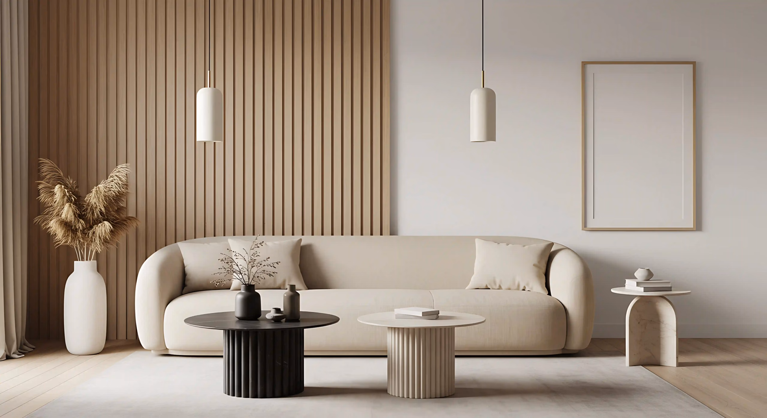
Living Room
The most common accent colors for a living room or drawing room are bold, high-energy, and high-contrast, creating a focal point, such as:
- SW 6390 Bosc Pear
- SW 6244 Naval
- SW 6868 Real Red
- SW 7066 Gray Matters
Bedroom
Bedrooms emphasize softness, calm, and elegant tones. Some common color choices for bedrooms are:
- SW 6257 Gibraltar
- SW 6336 Nearly Peach
- SW 7135 Twinkle
- SW 7666 Fleur De Sel
Kitchen and Dining
Kitchens and dining rooms are the most common areas to have accent colors. Some common accent colors for these rooms include:
- SW 6208 Pewter Green
- SW 9177 Salty Dog
- SW 2820 Downing Earth
- SW 6564 Red Clover
- SW 9698 Corallite
Bathroom
Bathrooms often observe accent colors in the form of vanities, tiles, and backsplashes. Some common colors are:
- SW 9040 Reseda Green
- SW 7036 Accessible Beige
- SW 3063 Charcoal
- SW 6993 Black of Night
Common Mistakes to Avoid with Accent Colors
When designing your room with accent colors, make sure you’re avoiding the common pitfalls many first-time painters face. These include:
- Using too many accent colors at once
- Not considering undertones or lighting
- Clashing colors that disrupt visual flow
- Forgetting to repeat the accent colors throughout the space
- Not focusing on the finishes (gloss, semi-gloss) of associated colors
When to Hire a Professional Painter
When designing an intricate look for your room, hiring a professional painter can add great value to the process. It’s hard to plan and execute a complete makeover without a professional painter. You can’t DIY this process without a solid understanding of color combinations, color mixing, and paint formulations. And here at Colorado Commercial & Residential Painting, we’re ready to help make this process easier than ever. Get in touch today to receive a quote, and let our team help you design your perfect palette.