When you walk into a beautifully decorated room, there’s usually something that catches your eye and makes the whole space look alive. If your home feels a bit flat, the right accent color might be exactly what’s missing. In this guide, we’ll walk you through what accent colors are, how to choose accent colors that complement your existing decor, and creative ways to incorporate them into any room.
What Are Accent Colors?
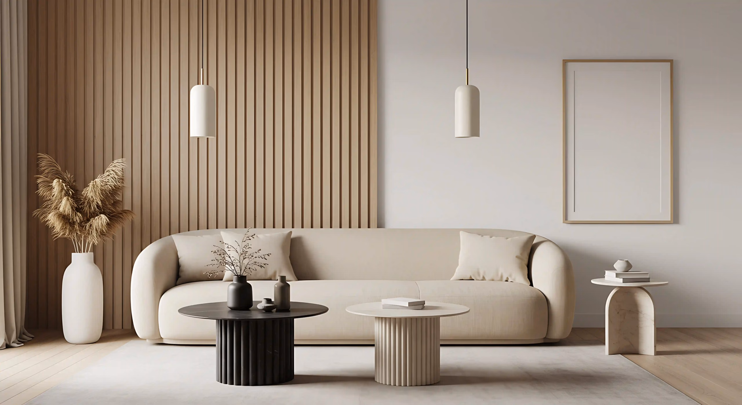
Accent colors are secondary shades that add depth to your design. These colors stand apart from your main color palette to create noticeable contrast in a room. By doing this, they add visual excitement and help certain elements of the room grab your eye, delivering a layered look that feels balanced yet interesting.
Your main colors dominate your space and establish the foundational mood you want to achieve. Accent colors work differently by appearing in limited amounts to emphasize specific features and break up monotony.
Why Accent Colors Matter in Interior Design
Accent colors matter in both residential and commercial design because they serve several purposes:
- Enhance the mood: Your choice of accent can completely shift the mood of a room. For example, bright reds like Sherwin-Williams Heartthrob SW 6866 energize a workspace, while soft blues such as Sleepy Blue SW 6225 can make a bedroom more peaceful.
- Add personality: Accent colors break up neutral areas and give rooms character, reflecting your personal taste.
- Create cohesion: When you repeat the same accent color in your curtains, pillows, and artwork, everything feels connected.
- Easy updates: You can refresh your space quickly by swapping accent pieces without major renovations or expensive renovations.
How to Choose the Right Accent Color
Here are some tips for picking accent colors that elevate your interior design.
Consider the Base Color Palette
Start with what’s already there. Your walls, flooring, and largest furniture pieces form your base color palette. The color wheel helps you find compatible options. Choosing a shade from the opposite side creates bold, eye-catching contrast, like pairing blue with orange or purple with yellow. Selecting colors that sit adjacent to your base tone produces a softer, more unified appearance, such as combining blue with violet or green.
Think About the Mood and Function of the Room
Colors affect the mood of a room in which you spend your time. Warm accents stir energy in gathering spaces, with options like Sherwin-Williams Butter Up SW 6681 for kitchen walls and floors, Glamour SW 6031 for dining areas, and Pewter Green SW 6208 for living rooms. Cooler tones help with concentration and rest, so you may consider Alpaca SW 7022 for offices, Kingston SW 9677 for bathrooms, and Serenely SW 9632 for bedrooms.
Use the 60-30-10 Rule
This straightforward formula prevents color overload and sustains visual interest. Apply your primary color across 60% of the room’s surfaces, like walls and large rugs. Introduce your secondary color on roughly 30% of the space using furniture upholstery and drapery, and use your accent color on the remaining 10% in small, decorative items or accent sections on the walls.
Factor in the Lighting
Natural and artificial lighting affect how colors appear. Rooms with lots of natural sunlight can handle broader, richer accents. Dimmer spaces need lighter shades that bounce light around. Test your color samples in the morning, midday, and evening to see how they change under different lighting conditions.
Popular Accent Colors in 2026
Painting trends this year are embracing warmth and natural inspiration for interior spaces. Popular shades move away from harsh minimalism toward spaces that feel genuinely lived in and loved.
Bold Jewel Tones
Gemstone-inspired colors are bringing depth and character to modern interiors.
- Emerald Green: This vibrant green creates a luxurious feel while keeping spaces calm. You can pair Sherwin-Williams Zeus SW 7744 with wooden furniture and gold hardware for an upscale look.
- Navy: Rich blue tones make rooms cozy and protected from the outside world. Consider Sherwin-Williams Naval SW 6244 when designing home offices and reading nooks where you want to encourage relaxation and focus.
- Deep Burgundy: Rich wine colors introduce warmth with a refined touch that never feels overpowering. These shades create intimate dining spaces and stylish powder rooms with Burgundy SW 6300 and Aged Wine SW 6299 that leave a lasting impression.
Warm Earthy Hues
Natural landscape colors are taking over from the cool grays that dominated recent years. Here are a few examples:
- Ochre: Golden yellows with brown undertones brighten rooms naturally. Richer, deeper variations are especially popular now, like Sherwin-Williams Golden Rule SW 6383 and Koi Pond SW 7727, which adapt well to different lighting, making them versatile for various rooms.
- Rust: This earthy red-brown adds a touch of vintage charm while giving rooms a collected, curated look. Add Sherwin-Williams Redend Point SW 9081 as an accent color that complements both neutral palettes and contrasting colors like teal.
Soft Pastels
Lighter, gentler colors create peaceful spaces where relaxation comes naturally. These subtle shades work wonderfully in bedrooms and bathrooms. Below are a few options.
- Blush: Soft pinks function as updated neutrals with more warmth than gray. Replace boring beige with Sherwin-Williams Romance SW 6323 as a softer replacement. You can pair it beautifully with crisp whites or navy for a balanced contrast.
- Sage: Muted green with a hint of gray brings a fresh, natural feeling to your home. Sherwin-Williams Evergreen Fog SW 9130 or Courtyard SW 6440 fits farmhouses and modern apartments equally well. It looks stunning on kitchen cabinets and bedroom walls for a refreshing effect.
- Lavender: Soft purples add elegance without shouting for attention. It’s perfect for bathrooms, kitchens, and bedroom accent walls with Sherwin-Williams’ Potentially Purple SW 6821, Thistle SW 6283, and SW 6829, which bridge both warm and cool design schemes.
Metallics
Warm metallic finishes add dimension and light to interior spaces. These accents change appearance as natural light shifts during the day.
- Gold: Brass and warm gold touches continue to add sophistication and glamor. Sherwin-Williams Empire Gold SW 0012, Gambol Gold SW 6690, and Alchemy SW 6395 are ideal for drawer pulls, chandeliers, and photo frames throughout your space.
- Bronze: This reddish metal has an artistic quality to it that feels handmade. If you wish to, you can elevate pendant lights and bathroom fixtures with Tarnished Treasure SW 9118. The warm tones complement wooden elements and stone surfaces really well.
- Black Accents for Modern Interiors: Dark details create a sharp contrast, which you can define architectural features with Sherwin-Williams Trocorn Black SW 6258 on window frames, door hardware, and light fixtures. Black goes with almost any color palette and adds a contemporary edge.
Creative Ways to Use Accent Colors in Your Home
Below are some creative methods to incorporate pops of color into your living spaces:
Accent Walls
One painted wall in a striking color can completely change the ambiance in a room. This approach lets you be adventurous with shades you might hesitate to use everywhere. Accent color walls work particularly well behind headboards, sofas, or dining areas, where they frame your furniture nicely.
Trim, Doors, and Ceilings
Colored trim on baseboards and window frames highlights your room’s structure. Your front door is the first thing that people notice when they arrive at your home. You can also paint interior doors or even just the insides of cabinets for a fun surprise. Ceiling colors also matter, since darker shades bring the ceiling down, while using the same color as the walls makes spaces feel taller.
Furniture and Upholstery
Statement furniture, like colorful armchairs or ottomans, instantly energizes neutral rooms. Cushions, throw blankets, and rugs give you the flexibility to switch things up whenever you want a fresh look.
Decor and Tile
Vases, candlesticks, and decorative bowls help spread your chosen color around the room thoughtfully. Patterned tiles in checkerboard or herringbone create eye-catching floors and kitchen backsplashes. Different tile shapes combined build a custom-designed.
How to Balance Accent Colors With Neutrals
Neutrals like white, gray, and beige provide a quiet background that makes bold colors stand out. When you place vibrant colors against soft bases, they naturally become the room’s main attractions. The key is using these accent shades in limited amounts so your space feels lively without becoming chaotic or overwhelming.
Different textures add elegance that color alone cannot achieve. Mix smooth and rough surfaces with soft and hard surfaces for a high-quality, complete look.
Accent Colors for Different Rooms
If you’re choosing accent colors for your home, consider what each room is used for:
Living Room
Your living room is where you relax and entertain. So, darker shades bring a cozy, elegant feel, perfect for evening gatherings. Brighter options, on the other hand, like Torchlight SW 6374 or Pennywise SW 6349, make the space inviting for guests.
Bedroom
Your bedroom is for rest, so choose colors that are calming. Gentle blues or soft lavenders help you wind down after long days, making Sherwin-Williams colors like Moonmist SW 9144 and Veiled Violet SW 6268 ideal for better sleep.
Kitchen and Dining
Pick accent colors that make mealtimes more enjoyable. Warm, red tones stimulate appetite, so use Foxy SW 6333 and encourage lively conversation at the dining table. Peachy hues such as Intimate White SW 6322 and Nearly Peach SW 6336 make the space feel welcoming for family meals.
Bathroom
Your bathroom should feel refreshing and peaceful. Light shades bring a spa-like environment for daily routines. You can make the space feel more relaxing with Sherwin-Williams Tame Teal SW 6757 or Mint Condition SW 6743 and create the kind of atmosphere you need each morning and evening.
Common Mistakes to Avoid with Accent Colors
Watch out for these common errors when using accent colors.
- Using too many accent colors creates visual clutter and eliminates any clear focal point.
- Ignoring undertones or lighting can make your color look drastically different throughout the day.
- Choosing colors that clash with your base palette disrupts the room’s overall harmony.
- Placing accent colors in just one spot makes the design feel random and incomplete.
When to Hire a Professional Painter
You should hire a professional painting company when you want expert help choosing accent colors. They can help you develop a consistent look throughout your home by understanding how different shades interact with natural light at various times of day. Their experience prevents common errors like selecting colors that clash or feel out of place once applied to your walls. The quality of the paint application directly impacts both the appearance and the durability of your paint job. Skilled painters handle surface preparation correctly and apply paint with precision, resulting in even coverage and clean edges that maintain their look for years.