Now might be perhaps the best time in recent history to repaint an office. People have been working from home for the past year and a half, but offices are starting to reopen countrywide for employees. These openings are varying state by state and company by company, but with many employees continuing to work from home, now is a perfect time to repaint an office without disrupting any work. No matter what you call your “office,” here are some commercial office paint color ideas.
Office Color Psychology
When analyzing and looking at different commercial office paint color ideas, it is important to consider the theory of office color psychology.
Office color psychology is the basic theory that different paint colors can help spur creativity, productivity, or focus. There have been many studies that show that color psychology helps improve not only employee productivity and satisfaction, but also positively influences how clients and visitors perceive your business.
Office color psychology draws from the fact that people perceive different colors to have different meanings: for example, in the USA, people often perceive red as bold and exciting and perceive blue as calming.
Color meaning can either be culturally specific or biologically innate, and colors generally influence behavior automatically. Office color psychology takes advantage of these preconceptions of color to create a workspace that is conducive to employee productivity and performance.
Now, let’s take a look at which colors are best for specific purposes in the office, and hopefully, they help spark some ideas for your office:
Best Colors for Focus and Productivity
There are a variety of colors that work well to spur focus and productivity depending on the industry, job duties, and desired level of focus.
Light Blue
Industries where employees need to be productive and perform repetitive tasks love the color of light blue. This color is soothing, encouraging clear thoughts and reducing mental strain.
Red
Several scientific studies have found that red is a stimulating color, so it increases heart rate and boosts blood flow. If your job requires you to be mentally alert or physically active, red is a great choice. Don’t use red in excess, however, as it may promote aggression or competitiveness.
Yellow
Since it boosts attention levels, yellow is often said to be the learning color. Including yellow in areas focused on learning can help employees absorb and retain information better.
Orange
As a combination of intense red and attentive yellow, orange is a great color to stimulate both the mind and the body. Orange is best used as an accent color to boost productivity, as too much orange can be distractive.
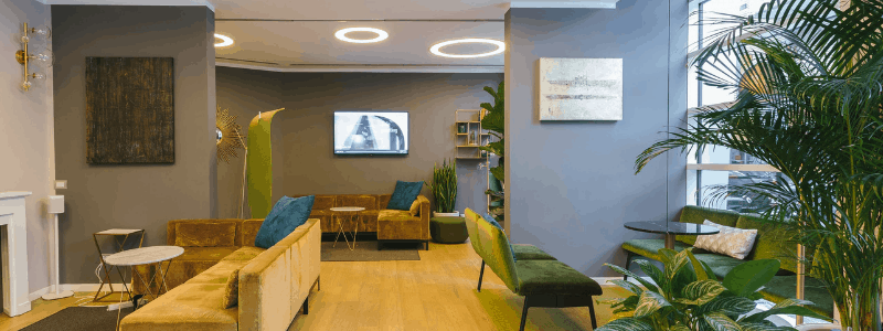
Green
Green is a gentle and easy color, which is perfect for offices where people frequently work long hours. A great way to include “green” outside of paint is by having plants around the office. And there are certain colors that really help the green plants “pop” out around the office, like orange or yellow.
Best Colors for Creativity
Traditionally, colors that work well to boost creativity are ones that are energizing and exciting. If you’re in an office where you are needing to be creative, here are some good commercial office paint color ideas for creativity:
Yellow
Yellow is also a great color for creativity since most people associate it with the sun, and therefore warmth and light. Yellow can inspire excitement and innovation.
Red
Red’s intense and emotional properties can stimulate and excite you to do creative work. Just like for productivity, red is best used sparingly.
Orange
Adding touches of orange around the office can give it a vibrant and warm feel, which creates a sense of confidence and comfort while still being fun.

Best Colors for Comfort
The best colors for comfort are traditionally lighter colors that can add spaciousness and an airy feeling to the office.
Blue
Blue is the first color that comes to people’s minds when they think of calming colors. Sky blue in particular has a refreshing, calming, and soothing effect that is perfect if you often deal with agitated or nervous customers, such as if you are a dentist.
Pink
Pink has similar warmth and energy as red without having such an intensity. Pink is so effective at relaxing people that many prisons use it to calm violent inmates! It is a warm, feminine color that radiates calmness and hope.
Green
Green is a restful and reassuring color that is often associated with well-being and balance. Green color in an office can help to “trick” a brain into thinking it is outside, which is proven to help relax anxious and nervous individuals.
Pastel
Light and airy, pastel colors are just colors that contain a lot of white. Since they are less saturated, pastels are often perceived as soft and soothing, which is perfect for inducing calmness.
Best Colors for Power
Dark, intense colors traditionally convey power best.
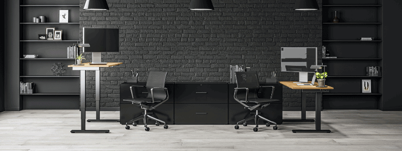
Black
Black is often associated with power, authority, and control. If used properly, it can make your office look both mysterious and elegant. Too much black, however, can come across as sinister.
Brown
Pairing rich brown wood furniture with a brown backdrop is a tried and true method to showcase power and strength. Although it has the same dark properties as black, brown also has a warmer, earthier feel that balances out the mystery and intensity associated with black.
Best Colors for Happiness
To provoke happiness, either bright or soothing colors should be used.
Yellow
Yellow, in addition to its other properties, is also a bright fun color that will excite people. Many people associate it with the sun, and since sunlight promotes the release of pleasure and relaxation hormones, yellow has a similar effect.
Orange
Orange has been proven to increase collaboration and spur conversation. Including orange in break areas can help employees spark up conversations that fill our need for social inclusion while simultaneously providing us with a full mental detachment from work.
Pink
Deeper pink is a great color to evoke the energy and happiness of red without its intensity. It is best used as an accent color, as too much pink can feel draining and claustrophobic.
As you can see, there are truly endless opportunities for different commercial office paint color ideas. The best color and color combination will depend on your individual needs, such as the industry you work in and whether this is a traditional office or home office. If you’re looking to repaint to optimize productivity and happiness, you should look no further than Denver painting contractors.
We have decades of experience and will work with you to tailor your paint job to your specific needs. Contact us today!